I was at a color seminar a few weeks ago in Vancouver given by the very knowledgeable and iconic Leatrice Eiseman, ASID, IDSA, FGI, CGM. Leatrice is the author of seven books on color. She is a color consultant to many industries and is the executive director of the Pantone Colour Institute. I am fortunate to hear her speak every year on the Color Forecast Trends for the coming year. This year "Purple" is one of the hot color trends for Living Spaces. Like most things, new trends are slow to take effect on one's psyche. They trickle in on a subconscious level and then all of a sudden you are seeing that trend everywhere. So now that Purple was on my radar screen, I was pleasantly surprised to get back to my office and see Elle Decor March issue which had just arrived, and voilà a light purple wall was featured front and center on the cover. I have also been collecting images of various shades of purple rooms in my file for awhile and I now have enough ammunition to do a post on this amazing color. In doing my research for this post and going through my paint fan decks I found a glaring shortage of this color. Pantone has selected the color Blue Iris (PANTONE 18-3943) as the 2008 Color of the Year . Lilac, Iris, Mauve, Violet, Lavender, and Heather are all softer versions of the color Purple and are delicate and romantic, while deep or bright purples like Aubergine, Grape, Plum, Eggplant, and Iris are bolder and more dramatic.

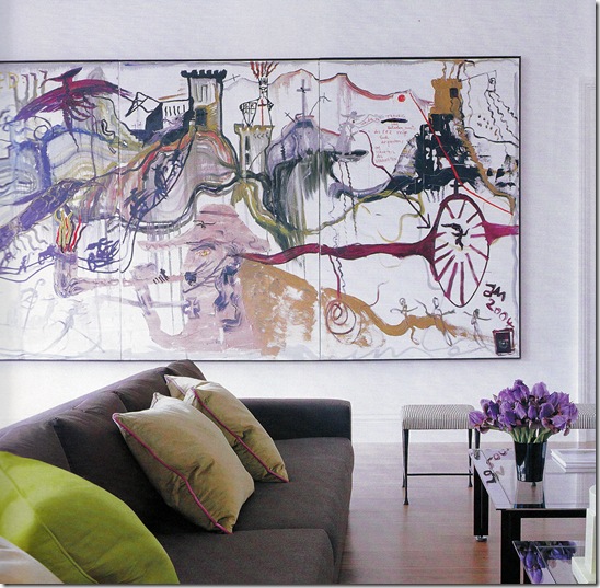
This picture could have been used for my post on {The Color Orange} This soft shade of purple is such a nice compliment for so many colors. It goes well with orange, yellow, fuchsia, green, blue and taupe.
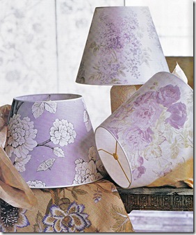
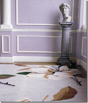
Above 3 pictures Elle Decor March 2007
Madeline Weinrib Area Carpet
Jeffery Bilhuber has chosen to upholster two chairs in a deep rich shade of purple.
I like how the shades of taupe and beige in the room tend to accentuate and enrich the chairs.
This library/office with painted walls in a beautiful shade of lilac is reminiscent of the 50's, but totally is recognizable
as being set 50 years fast forward with the advent of Apple Computer and the Zebra inspired wool area carpet.
photo Elle Decor March 2008
There is something so soft and feminine about the feel of the wallpapers that have been used for these lamp shades.
I can smell lavender.
photos Elle Decor March 2008
A classic English Campaign sofa with arms that drop down to extend the length for sleeping on.
photo EKB Interiors
A set of very fine Macassar Ebony side chairs for sale on 1st Dibs designed by Jules Leleu French Circa 1923
And now we move on to the deeper shades of purple: Aubergine, Grape, Plum, Eggplant. So very appealing and dramatic. In Medieval times Royalty & high officials of the Catholic Church were the only ones able to wear purple because of the expensive and rare dye that was used to make this majestic color. So for many centuries it was associated with Royalty, Wealth and Majesty......Purple was the favorite color of Egypt's Cleopatra.

Velvet seems to be the right fabric choice and purple a very fitting color for these chairs in the style of William Haines.
photo Antonia Hutt
A dramatic use of deep aubergine.
photo S Gambrel
The color of the cushions in this sunroom remind me of the color of a grape popsicle.
photo Tom Scheerer
I don't think that any other color would have worked as well for this room. I would feel like a Queen sleeping here!
Hotel Luxe Marrakech
There is even a Blog called Purple Area written by a wonderful Blogger located in Malmo Sweden
Is Purple your favorite color? What is your favorite shade of Purple?
For other posts on Color click here
Patricia Gray writes about 'WHAT'S HOT 'in the world of Interior Design, new and emerging trends, modern design, architecture,
and travel, as well as how your surroundings can influence the world around you.
© Patricia Gray Interior Design Blog, 2009


No comments:
Post a Comment